Solving the Great Elevator Button Confusion in India: Up or Down?

If you've ever hesitated in front of an elevator, wondering whether to press the up arrow or down arrow, you're not alone. This seemingly small dilemma is surprisingly common in India, where many people misinterpret the function of elevator call buttons. But what causes this confusion, and how can we solve it?
In this blog post, we’ll explore the problem and propose practical solutions to make elevator operation more intuitive for everyone.
The Root of the Problem
The confusion stems from a misunderstanding of how elevator call buttons work. People often assume that pressing the up arrow means the elevator will immediately move upwards and that pressing the down arrow will make it go down. In reality, the buttons indicate the direction you want to travel, not the current movement of the elevator.
For instance:
- If you’re on the ground floor and want to go to the second floor, you should press the up arrow.
- If you’re on the fifth floor and want to return to the ground floor, you should press the down arrow.
This misinterpretation leads to delays, inefficiency, and frustration for everyone using the elevator.
Practical Solutions to Eliminate Confusion
To address this common issue, here are some practical, user-friendly solutions:
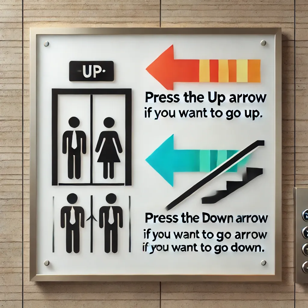
1. Clear Visual Instructions
Place a small sign near the buttons explaining their purpose. For example:
- "Press the Up Arrow if you want to go up."
- "Press the Down Arrow if you want to go down."
This simple step can make a significant difference, especially for first-time users in a building.
2. Use Icons Alongside Text
Adding small, intuitive icons next to the arrows can help:
- A person moving upstairs for the up arrow.
- A person moving downstairs for the down arrow.
These visual cues can be particularly helpful in places with high foot traffic, like malls or train stations.
3. Color-Coded Buttons
Introduce color coding for the buttons:
- Green for "Up."
- Red for "Down."
Colors are universally understood and can make navigation more intuitive.
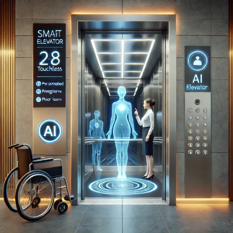
4. Interactive Screens
Replace traditional buttons with small digital screens or touch panels that explicitly ask:
- "Where do you want to go?" Options for Up or Down can be displayed clearly, removing ambiguity.
5. Audio Assistance
Install a speaker system that provides instructions when someone approaches the elevator:
- "Press the up arrow to go up."
- "Press the down arrow to go down."
This feature is especially helpful for visually impaired users or people unfamiliar with elevator operations.
6. Text-Based Buttons
Replace arrows entirely with text. For example:
- A button labeled “Up” instead of an upward arrow.
- A button labeled “Down” instead of a downward arrow.
This eliminates the need for interpretation and makes the operation straightforward.
7. Awareness Campaigns
Educate users about elevator functionality through posters, videos, or social media campaigns. Residential complexes, office buildings, and public spaces can distribute simple guides to clarify the purpose of elevator buttons.

8. Feedback Systems
Introduce feedback mechanisms where the elevator confirms the user's input. For example:
- If the up arrow is pressed, a small screen or light can display, “Lift is coming to take you up.”
- Similar confirmation can be shown for the down arrow.
Why It Matters
While this issue may seem trivial, it highlights a broader challenge of designing intuitive systems for public use. Addressing this small yet widespread confusion can:
- Improve the efficiency of elevator usage.
- Enhance user experience.
- Reduce frustration in crowded places.
Conclusion
Elevator button confusion is a solvable problem. By implementing clear instructions, user-friendly design changes, and awareness campaigns, we can make elevator operations seamless for everyone. The key lies in simplifying the user experience, keeping in mind the diverse demographics of our country.
The next time you approach an elevator, remember: press the direction you want to go, not the direction the elevator is moving. Let’s spread the word and make elevator travel stress-free for all!
What do you think of these solutions? Have you faced similar confusion? Share your thoughts in the comments below!
PS: Own blog idea. However content auto generated by ChatGPT.


Comments ()